Store locator ― 2017
Bringing retail to our digital domain
Project details
Background
The website had two seperate 'brick and mortar' pages with some overlapping content. However one page was focused on locating stores and the other page tried to explain which point of sales there are and what services they provide.
The brief
Our team was asked to come up with a solution that combines the goal of both pages. This way the user can find all our stores and corresponding information such as opening times and provided services.
My role
I delivered high fidelity wireframes and worked closely together with the Visual Designer in my team who was responsible for the UI.
what I did
Interaction Design

The old store locator page
Challenge
The old store locator page was poorly designed. The following points of interest needed to be improved:
1. A lot of copy
The page contained a long intro text which was totally unnecessary. It didn't serve the goal which is 'locating stores'.
2. Wrong prioritization
The most important interactions were presented 'under the fold', namely the search bar and the search results.
3. Poor interaction
To see a list of the results you needed to scroll down. If you wanted to see the map, you needed to scroll up again.
4. No additional info
We did not inform the user about opening times and provided services for each point of sale.
Design
Why reinvent the wheel?
With millions of users using Google Maps as their preferred tool to look up venues, it would be a shame not to make use of their patterns. Especially when we're already making use of Google Maps data. So instead of reinventing the wheel I borrowed some interaction patterns from Google Maps and used this in our store locator.
On large screens the map plays an important visual role and corresponds with the search results. Except for the default state in which I chose to only list the flag stores in the search results.
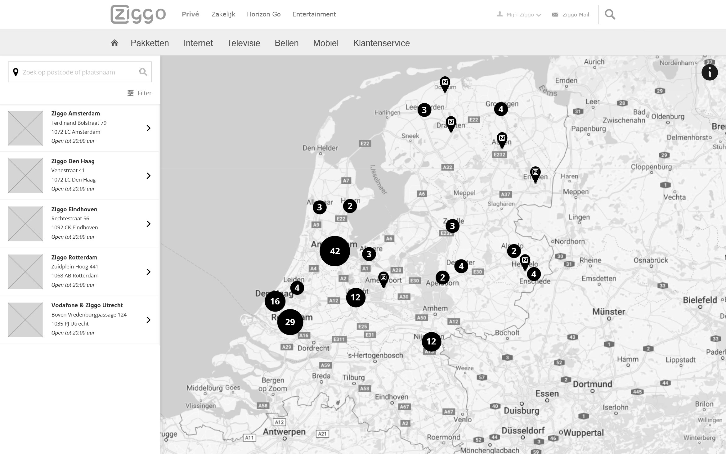
The map
The default state of the map shows the number of stores per region. When the user zooms in on the map, more pins will pop up.
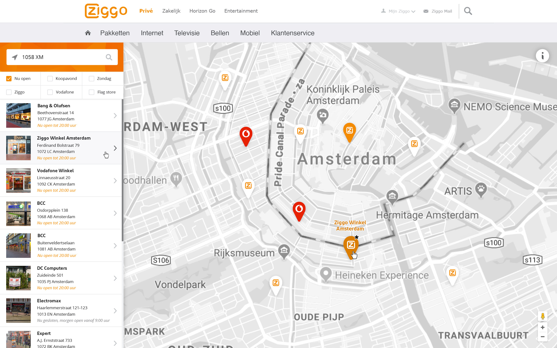
Search
Users can search using their location or fill in the zip code or city name of their choice. They can also filter by opening hours and brand (Ziggo or Vodafone)
Search results
By default the flag stores are listed. After a search query results are shown and sorted by distance. The first 10 results are displayed followed by a 'show more' button.
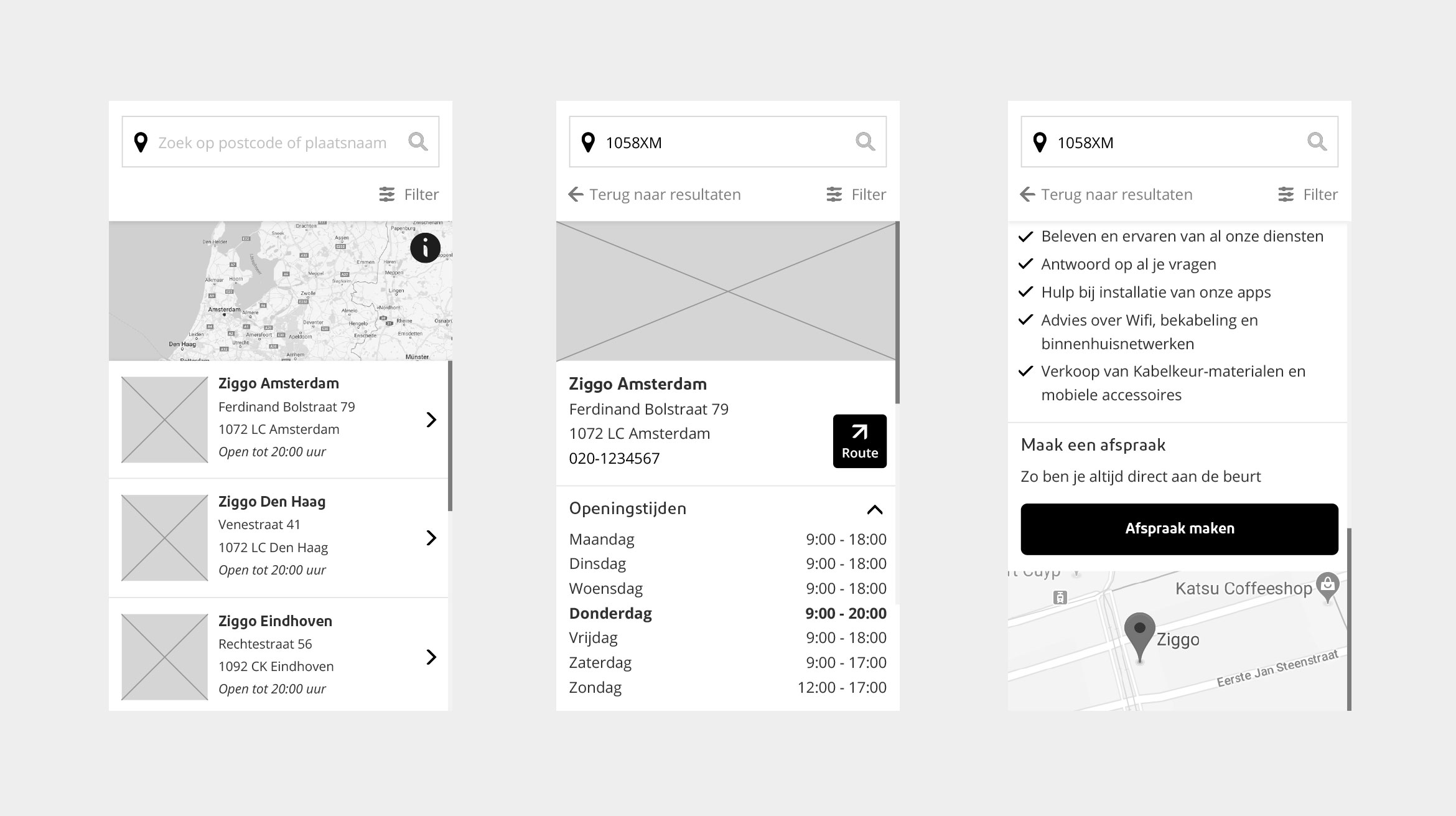
Details
The detail page of a store contains the address, opening hours, provided services, a button to open the route in Google Maps and a button to plan an appointment.
The map
The default state of the map shows the number of stores per region. When the user zooms in on the map, more pins will pop up.
Search
Users can search using their location or fill in the zip code or city name of their choice. They can also filter by opening hours and brand (Ziggo or Vodafone)
Search results
By default the flag stores are listed. After a search query results are shown and sorted by distance. The first 10 results are displayed followed by a 'show more' button.
Details
The detail page of a store contains the address, opening hours, provided services, a button to open the route in Google Maps and a button to plan an appointment.
Impressions


© 2024 EDDIE LAAN ― SR UX DESIGNER